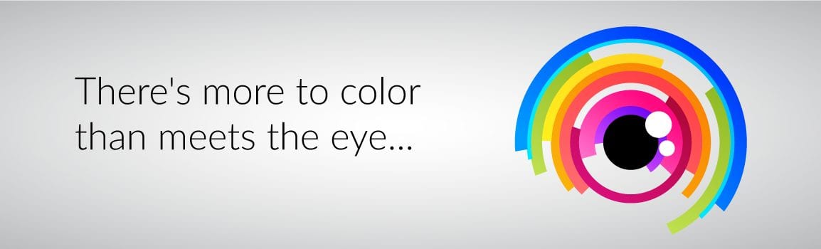
Did you know color is one of the first things our brains see when registering an image? Since color is your brand’s nonverbal form of communication, it is vital to know how consumers will interpret different colors. This puts a lot of weight on your choice of colors when planning your marketing, from logo design and print work to your website theme. When you harness the right color you can set a mood, convey an emotion, invoke a psychological reaction, or inspire people to take action. First we bring you the meaning behind three different colors.

Red
Red is a high arousal color, shown to raise blood pressure, and it gives us a sense of energy, passion, power, strength, youthfulness, and excitement. It is also associated with blood, giving it a feel of intensity. Red demands the viewers’ attention and can stop them in their tracks, stimulating a moment of cautious thought, while calling for action to be taken. Think brands like Coca Cola, Pinterest, Target, Nabisco, and Frito Lay.
Red is seen in both logos and advertisements every day. Brands like Pinterest and Coca Cola are very different companies, but convey power through their logos. Pinterest gives the power to create and Coca Cola provides the power to have fun – both using their iconic red logos. Frito Lay and Nabisco use red for their known ability to stimulate appetite.
Orange
Orange is a bright hue, reflecting excitement and enthusiasm, that brings both vibrancy and balance to a project. It is friendly, cheerful, and confident. Like red, it demands attention, but it’s a little more muted than the primary color and therefore feels less aggressive. Think Fanta, Crush, Nickelodeon, and Shutterfly.
Because of its association with fruit, orange is often seen in drink logos; Fanta and Crush are both good examples. Orange also sends a message of affordability – think Amazon. Its tone can be subtly seen in the Amazon logo, which is entirely black and white, except for a smiling orange arrow that connects A to Z. It’s not as bold or brash as red would be, but it still catches your eye and gives off a warm feeling.

Yellow
Colors can have contradictory meanings, and that’s particularly true when it comes to yellow. While the bright color has some optimistic associations like joy, sunshine, summer, and happiness, there are also negative implications. In some parts of the world, yellow is linked to illness, jealousy, cowardice, betrayal, and hazard.
McDonald’s, Nikon, National Geographic, and Sun Chips all use yellow in a positive way. Each of these companies is very different, but all share a brand color that suggests they bring joy and warmth to consumers’ lives. It has also been shown to stimulate mental processes, and therefore is utilized as a way to grab the attention of window shoppers.
This is only the beginning of colors and what they mean to your logo and branding. Check back later this month to learn what green, blue, purple, black, and white say about your business. If your brand is in need of a color overhaul or you’re just getting starting and would like guidance, we are here to help! Contact us or visit our website to learn more about what we can do for you and your brand image.