
The beginning of each new year triggers fond memories we’ve made, reminds us of growth from lessons learned, and brings a sense of wonderment about what the future holds. As marketers, we become giddy at the thought of NEW – new design concepts, new innovative tools and resources, new advancements for better experiences and big dreams for the future.
Looking forward to what the coming year has in store, we’re already beginning to see changes in processes, design and more. What are some of the top predictions for changes this year? Grab a coffee, kick back, and let’s take a trip to Daydream Land to imagine all the opportunities to explore and trends to anticipate in 2016.

We cannot stress enough how vital it is to provide users with the best, most seamless experience possible. Your company could feature the most outstanding web design ever, which you feel should be displayed in the Louvre next to the Mona Lisa, but if it isn’t easy to use and quick to load, users will jump ship and move on to the next.
Be mindful of what effect the interaction with your site will have on a user, and allow that to help determine the best route. For example, will your mobile site make someone want to toss their smartphone at the wall because their fingers have to go ninja-status, zooming in and out to read a product description? Or will they feel a sense of calm tranquility from the clean, intuitive design that does exactly what they want without having to do much more than lift a thumb?

A key factor that will contribute to giving the best user experience possible on your website is the first screen. With mobile screens becoming the primary screen users interact with, it is paramount to the success of your site – and business – to grow with the times and put smartphone screens as the top priority when developing design concepts. Focus on elements such as calls to action that require little to no extra work by the user, simple sign-up fields for capturing emails quickly, and easy-to-read content that is both effortless to view and full of rich, useful information.
A top-notch responsive design will cater to both mobile and desktop, leaving nothing to the imagination when using either device. For a superb example of a recent rebrand that encompasses the perfect balance of design, functionality and user-friendliness, look no further than Netflix. The company appears to have immersed itself into the life of the end user to fully understand how people use their devices these days and how to best cater to their needs. If you find your site is not able to provide a cohesive experience across every device, it’s time to take it under the knife for a facelift.

There is a saying that goes “if it doesn’t nurture your soul, get rid of it.” Take this flower-child-like philosophy to heart when it comes to your website and the creation of an excellent user experience. For each piece of content, every photograph, logo or form – ask yourself “What purpose is this serving?” If the answer isn’t a solid justification to keep it on your site, it’s most likely best to remove it and allow the user to engage with the pertinent information of your business, rather than sift through what may or may not be of interest.

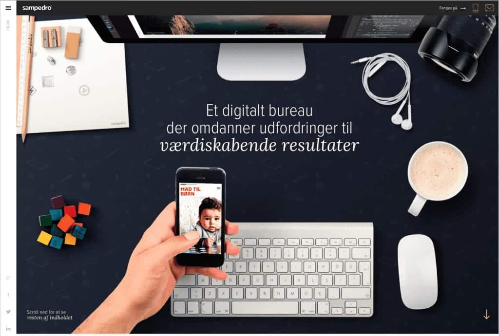
Intuitively designed websites are of the utmost importance, and with this in mind, the ‘navicon’ or Hamburger Menu will be your new best friend moving into 2016. Clever little hidden menus are starting to replace the more traditional navigation menus across all devices, desktop included. Check out some great examples of these hidden menus on websites across a wide variety of industries. Intuitive and space-saving, these menus not only provide more white space for you to work with visually, but also give a subtle sense of clarity that allows the user not to be distracted from more important elements of your site you want them to focus on.

The infinite scroll function became a huge trend in 2015 on some of the world’s most popular sites, including Facebook, Pinterest and Twitter, and has since been adopted by numerous sites around the web. What’s the new thing in 2016? Enter module scrolling, a layout that enables modules of a site to scroll independently from each other, like this prime example from a hotel in Rome showcasing two columns working in harmony side by side. While the functionality and feel of this trend is pretty nifty in itself, its purpose all comes back to the top priority – user experience. This scrolling feature on a site allows the user to continuously absorb content from your site without being interrupted by loading pages, searching for links via clicks, etc. and providing a one-stop-lane for your site’s entire library of contents.
To learn more about the trends and concepts reviewed in this post and how you can apply them to your marketing strategy, contact us today. We find this stuff interesting and exciting, and would love the chance to take this journey into the coming year with you to help your business grow. Cheers to 2016!